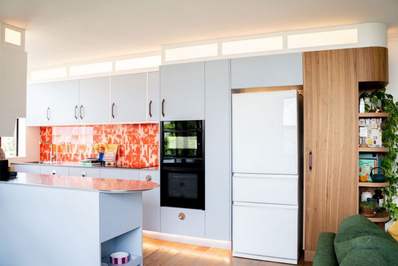
Blending retro charm with contemporary style, this custom kitchen renovation delivers a timeless design that feels both functional and inviting.
Starting point: a kitchen working against itself
The apartment itself dates to the 1980s, and its original kitchen reflected the era’s priorities more than its owners’. A closed U-shaped layout boxed the room in on three sides, and while it looked tidy enough, it made basic tasks harder than they needed to be. Cupboard access was awkward. There were too few drawers and no real pantry to speak of, so anything beyond daily essentials ended up stacked wherever there was room.
The clients, a professional couple who host often and cook most nights, weren’t chasing a dramatic redesign. They wanted a kitchen that worked, and one that stopped cutting them off from the rest of the apartment.
Opening the room up
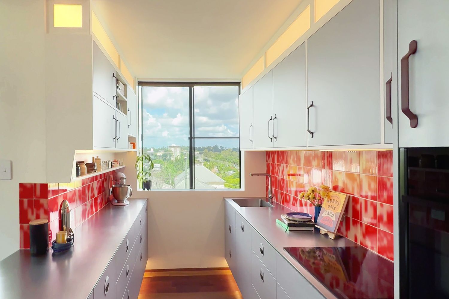
The single biggest structural move was removing the wall that had enclosed the kitchen from the living and dining space. It’s a simple change to describe and a significant one to feel. The kitchen stopped being a room you ducked into and became part of how the whole apartment is used, cooking, eating, hosting, and everyday life all happening across one connected space rather than three separate ones.
That shift also solved a smaller, more personal brief item: a spot for the household’s two dogs. A built-in feeding station now sits at the end of the peninsula, positioned so the dogs are part of the room during dinner prep and dinner parties alike, rather than underfoot or shut out.
Steel over timber, and why that mattered
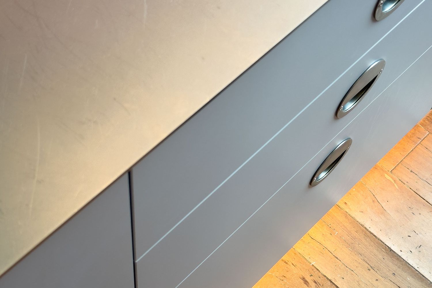
The clients arrived with timber benchtops in mind. After some design evolution, it was agreed that stainless steel would offer the durability the client desired but also provide a unique design focal point. One of the clients bakes regularly, and steel offered the kind of daily durability timber couldn’t promise, a surface that could take flour, heat, and heavy use without anxiety about marking it.
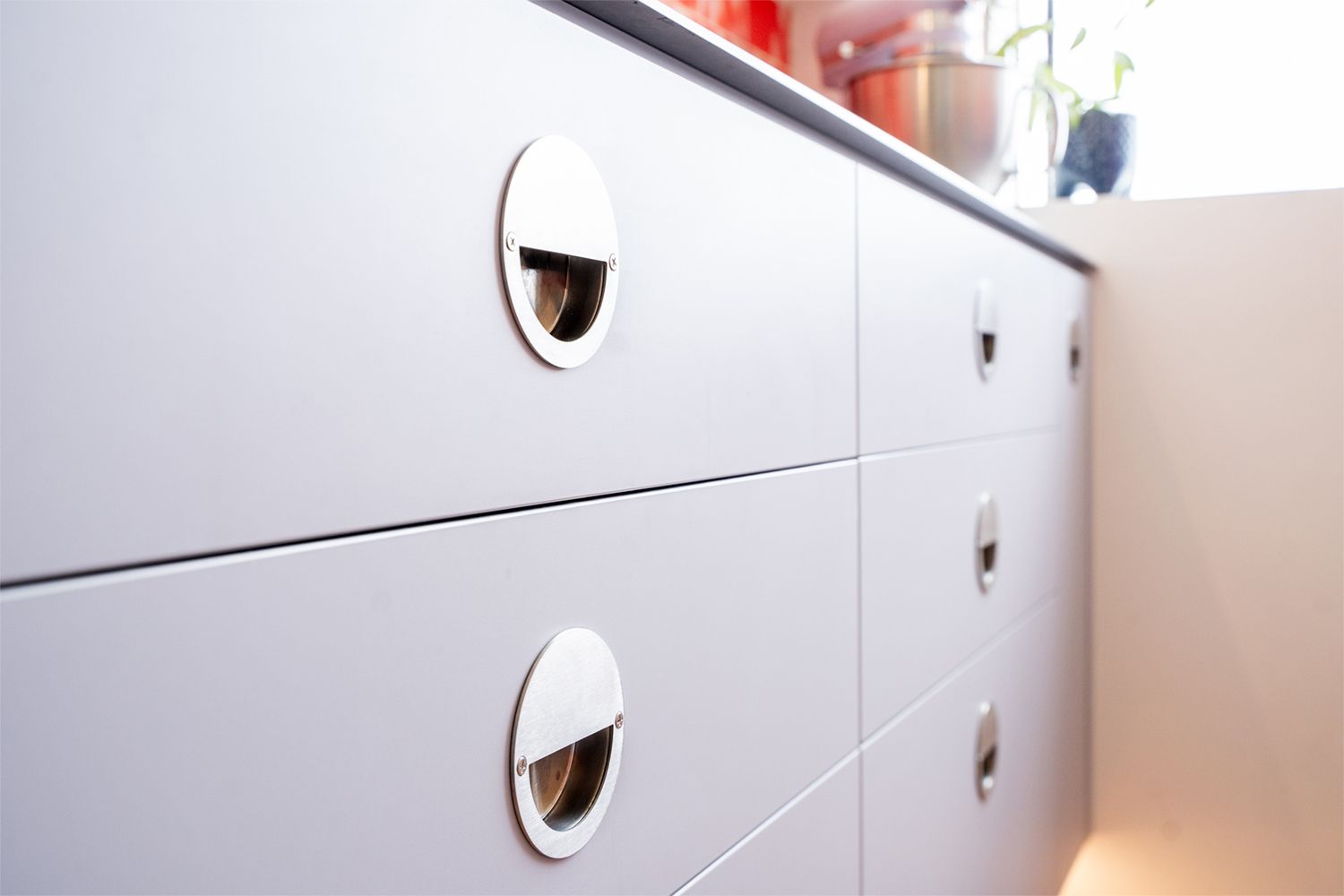
The final selection was a 5mm orbital-finished steel that softens with use rather than showing wear, taking on a subtle patina that feels intentional rather than tired. Paired with a welded in stainless sink, it gives the kitchen a quiet, utilitarian confidence that nods to mid-century kitchens without trying to hard.
Some design references arrive on purpose. This one arrived by accident.
Midway through developing the joinery for this apartment kitchen, DISKO Designs and the client settled on a run of acrylic bulkhead lighting, a practical solution for a low ceiling with limited depth to work with. It was only once the lighting was in place that the resemblance became obvious. The soft glow, the shallow profile, the way it sat above the cabinetry like a canopy. It looked like a milk bar.
That one detail became the thread the whole project pulled from. What started as a lighting decision turned into a broader conversation about warmth, nostalgia, and the kind of kitchen that feels lived in rather than simply finished. The result sits somewhere between a 1950s corner store and a contemporary Australian apartment, which is a strange combination on paper and an unexpectedly comfortable one in person.
Colour and warmth, deliberately placed
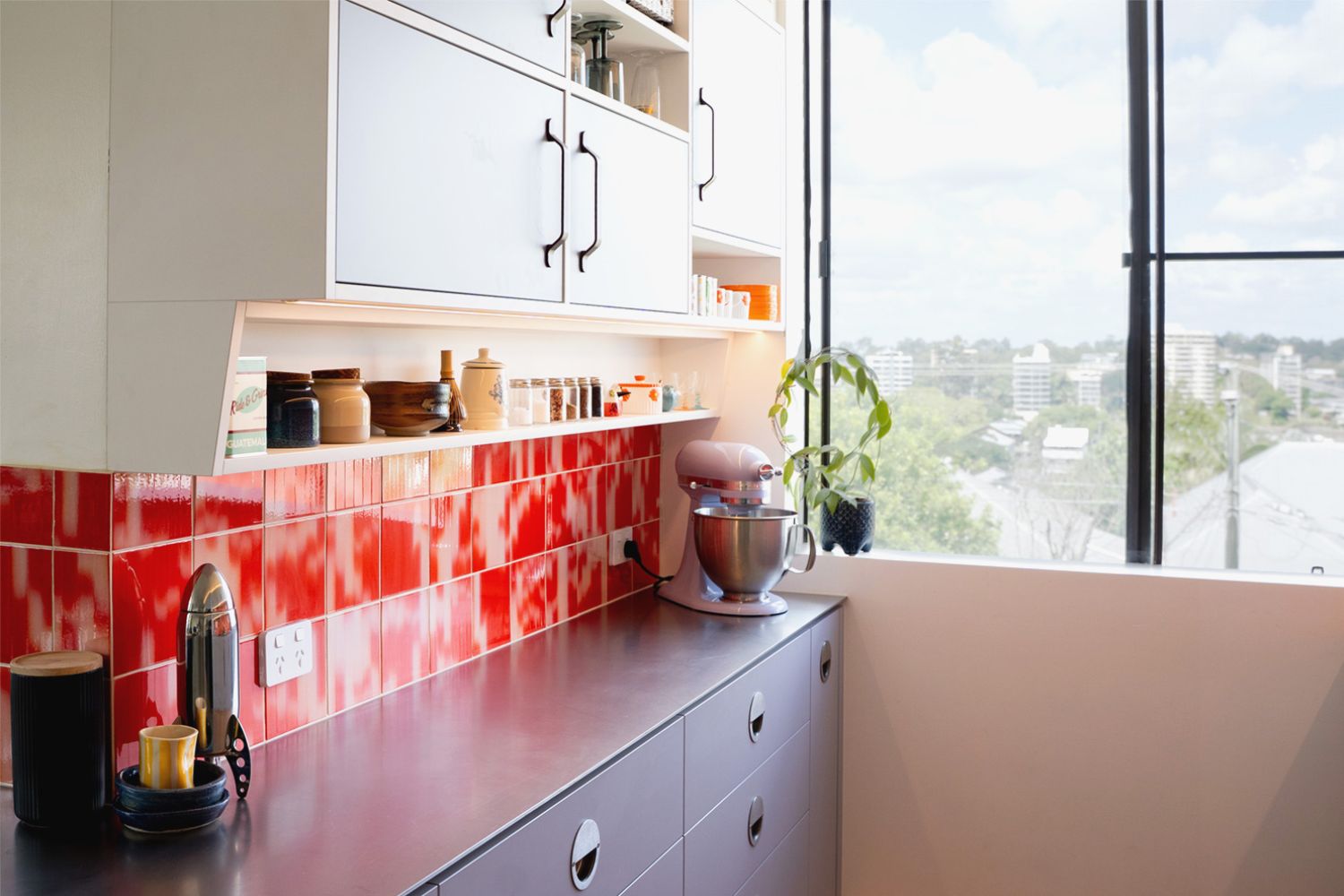
Against the restraint of steel and timber, the splashback carries the kitchen’s personality, and it’s the one element of the project that came from furthest afield. The tiles were hand-glazed specifically for this kitchen in Europe, a small, deliberate indulgence in a project otherwise built around restraint and daily practicality. It’s hard to imagine the room without them. They give the kitchen its focal point and, more than any other element, its sense of joy, a saturated, handmade surface among materials chosen mostly for how well they’d hold up to daily life.
Small pockets of open cabinetry means everyday items, the bowls, the jars, the well-used kitchen tools, are visible rather than hidden away. Nothing precious, nothing performative. The brief was never to build a showpiece kitchen too polished for daily life. It was to build one that could be lived in properly, where countertops could be used without hesitation and objects could sit out in the open without looking cluttered. The tiles are the exception that makes the rule work: one place where the design allowed itself to be purely decorative, and the room is better for it.
Twelve months, one considered result
The project ran close to twelve months from initial brief to completion. What emerged is a kitchen that resists easy categorisation: not strictly retro, not strictly contemporary, comfortable in both directions. The couple has lived with it for several months now and, by their own account, wouldn’t change a single element.
It’s a reminder that the best design decisions aren’t always the ones planned from day one. Sometimes they’re the ones you notice only after they’re built.
For more information