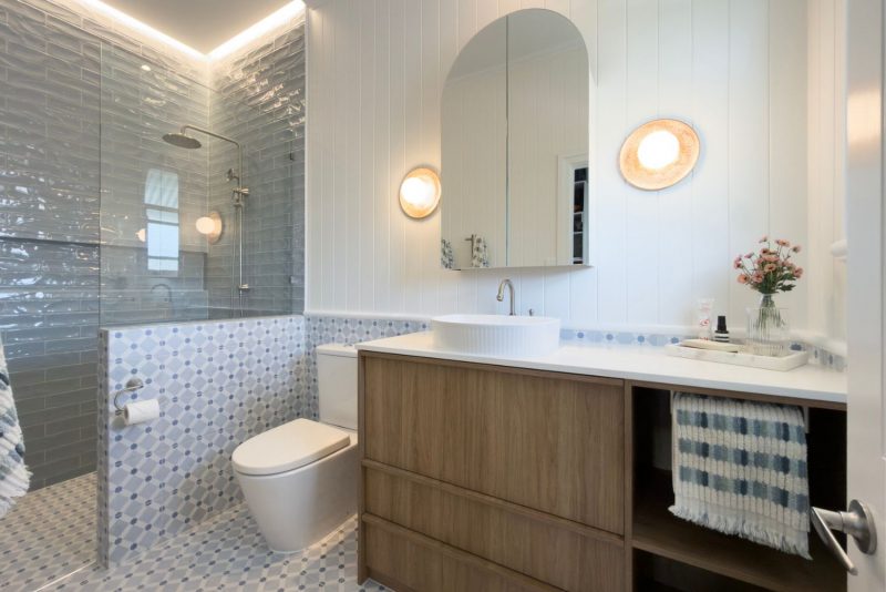
On paper, this ensuite had everything going for it. Generous proportions, good natural light, a strong architectural bones within a 1920s Queenslander. It should have worked. In practice, it didn’t, and the reasons were small enough that they were easy to overlook and frustrating enough to feel every single day.
The shower door swung into the showerhead on one side and clipped the towel rail on the other. The vanity drawers couldn’t open unless the bathroom door was closed first, a small daily negotiation most people would eventually stop noticing and simply live around. Storage was scattered and insufficient, so the things that should have been close at hand never quite were. None of it was dramatic. All of it added friction to a room meant to be one of the easiest in the house to use.
The clients came to Disko Designs not because the bathroom looked wrong, but because it felt wrong in many small ways they couldn’t quite name. What they wanted was fresh thinking: a space that felt joyful and beautiful, but that also worked, and worked in a way that felt like it belonged to the rest of their home rather than sitting apart from it.
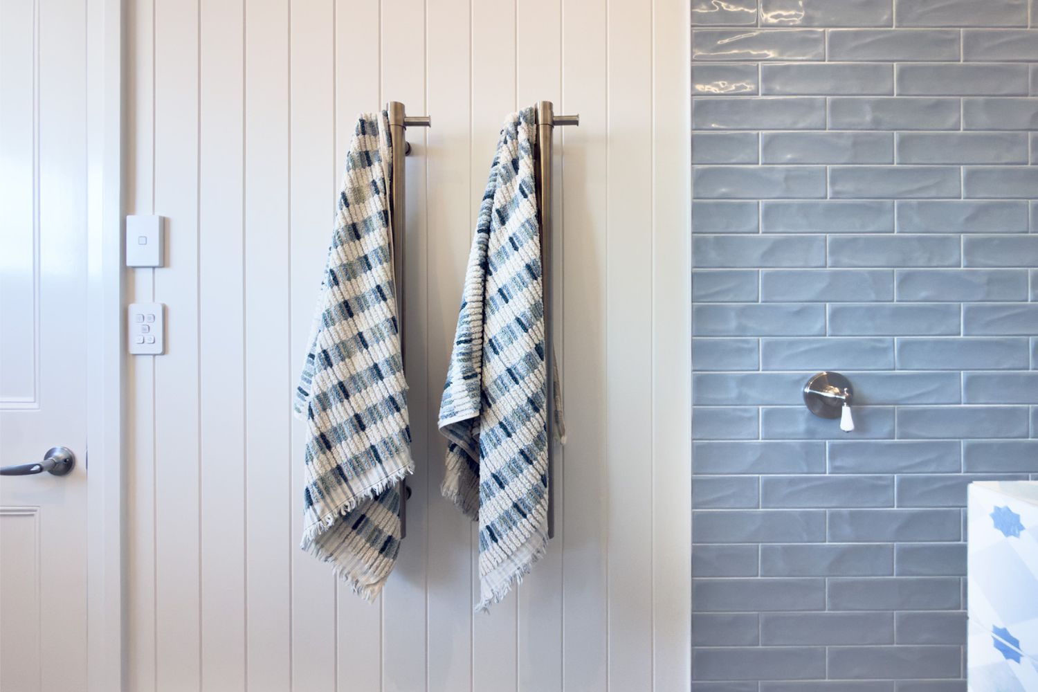
Storage as the starting point
Most renovation stories lead with a big move: a wall removed, a layout flipped, a material swap that changes the tone of the whole room. This one didn’t have that single dramatic gesture. Instead, the project was built from a series of smaller, deliberate corrections, and storage sat at the centre of nearly all of them.
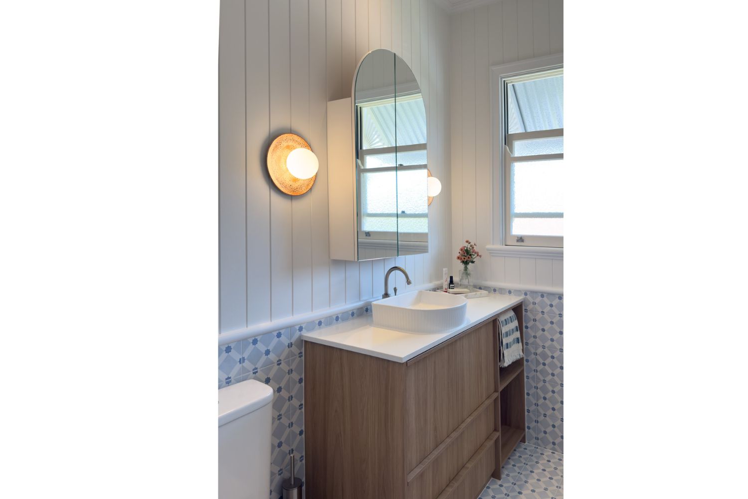
The existing vanity was one of the clearest offenders. Door conflicts meant it could only really be accessed from one side, so half its potential storage was functionally useless. The redesign reworked the vanity into deep drawers paired with open storage, giving the couple somewhere to put everything and, just as importantly, somewhere obvious. Nothing buried, nothing forgotten at the back of a cupboard that never quite opened properly.
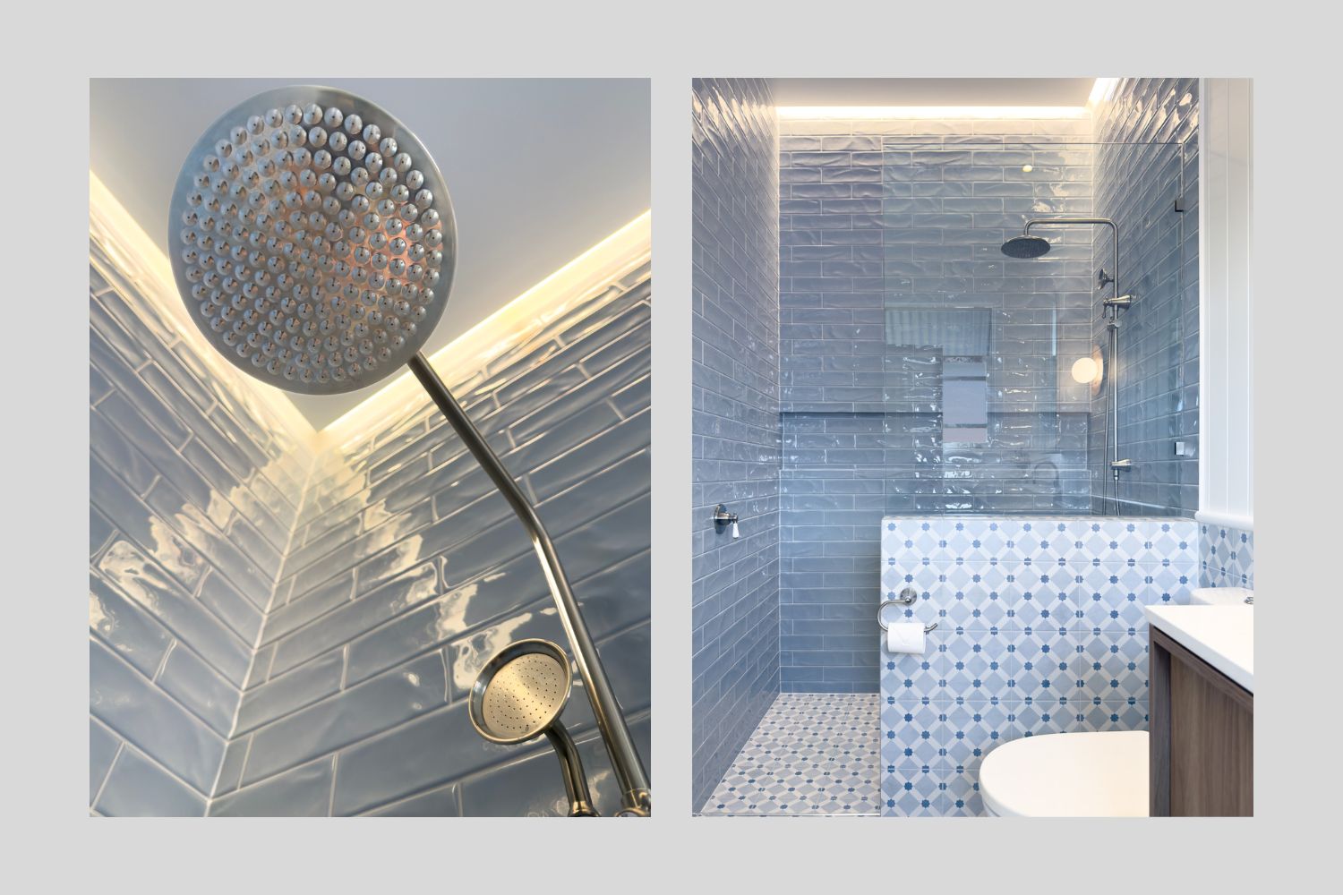
A surface-mounted shaving cabinet added concealed storage without eating into the room’s footprint, and its soft arched profile gave the fittings a bit of personality rather than treating storage as purely utilitarian. Niches built into the shower and surrounding walls did similar work at a smaller scale, giving everyday items, shampoo, soap, the things used without thinking twice, a defined place to live instead of a shelf edge to balance on.
It’s the kind of solution that’s easy to underestimate from a photograph and impossible to underestimate once you’re living with it. Good storage doesn’t announce itself. It just means you stop thinking about where things go.
Fixing what wasn’t working
Underneath the layout issues sat a more serious problem: failing waterproofing that meant the room wasn’t performing at a fundamental level, regardless of how it looked. Any renovation here had to resolve that properly before anything else could matter, and that unglamorous groundwork is often the part of a project nobody sees in the finished photographs, but the part that makes everything else possible.
With that foundation addressed, the layout could be reconsidered on its own terms. A simplified, open shower arrangement removed the door-and-fixture conflicts that had made the space so frustrating, and a reconfigured vanity brought clarity to a room that had previously asked its owners to think carefully about the order they did things in each morning.
Joy, without losing the heritage
None of this needed to come at the expense of character. The home’s 1920s heritage runs through the finished room rather than around it, helped along by a set of handmade wall sconces from a ceramist, small details that give the space warmth and a sense of craft without pulling focus from the practical work happening underneath.
That balance, joyful without being showy, resolved without feeling clinical, is really the whole story of this project. There’s no single dramatic before-and-after moment to point to. What there is instead is a room that finally does what a bathroom is supposed to do: work quietly, every day, without asking anything of the people using it.
The clients wanted something beautiful that also felt like part of their home. What they got was both, built from a long list of small decisions that, together, add up to something that finally feels effortless.
For more information