Rich, nostalgic hues to provide comfort and character this winter
As we transition from the sunfilled summer of brighter colours into the cooler months, the Dulux Colour Forecasters predict a shift toward muted tones and spaces that are bold and expressive, reflecting individuality, encouraging reminiscence and providing emotional warmth.
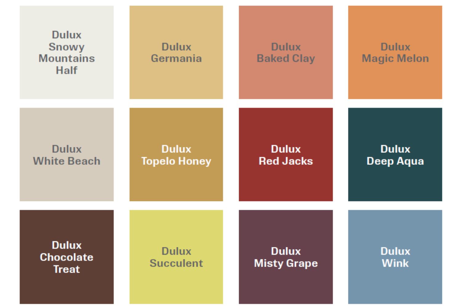
Dulux Evoke – one of three palettes from the 2026 Dulux Colour Forecast – embraces blush pinks, burnt orange, warm golds and dramatic tones, to create a sense of warmth, depth, and nostalgia. “The palette is perfectly suited to autumn, creating a cocooning atmosphere that mirrors the season’s comfort, reflection, and retreat.” says Lauren Treloar, Dulux Colour and Design Manager.
The Evoke palette encourages consumers to embrace maximalism, individuality and the rise of cottage core, creating a retro ‘nana chic’ space rich in personality and authenticity. The palette provides the perfect stepping stone for those looking to use colour to create a cosy, warm space to provide comfort in the cooler months.
“Lighter tones such as Dulux Baked Clay, Dulux Magic Melon, and Dulux Germania pair beautifully with the deeper, colourful tones of Dulux Misty Grape, Dulux Wink and Dulux Red Jacks to create a character-filled space that truly reflects its resident.” says Treloar.
Stylist Bree Banfield teamed up with the Dulux Colour team, to bring the Dulux Evoke palette to life, transforming the dining room and bedrooms of a family home in Melbourne’s Bayside. Drawing inspiration from ’50s, ’60s, and ’70s design, the team used bold, comforting colours and textures to create spaces that balance the beauty of imperfection with nostalgic charm.
“What immediately struck us about the home was the sense of openness. It was a modern blank canvas, offering clean lines and generous natural light but in need of an injection of warmth and personality that better reflected the family residing within it.” says Treloar. “The space is primarily used as a central living and gathering area for the family, so our design approach was to layer colour and thoughtful styling to transform it from a neutral and understated room into a welcoming, character-filled environment”.
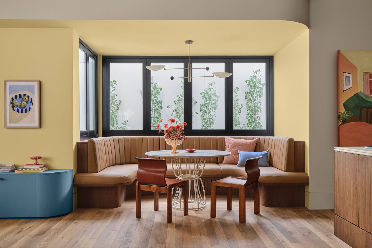
In the dining area, warm golden tones of Dulux Germania make a striking statement within the alcove, complemented by Dulux White Beach on the surrounding walls. The accent colour elevates the space, creating a welcoming and comforting atmosphere. Layering vintage, handcrafted, and sustainable décor alongside more vibrant shades from the Evoke palette, the team added depth, texture, and interest throughout the room.
Discussing Banfield’s approach to incorporating Dulux Evoke throughout the dining room, she recommends focusing on proportions first. “Choose one or two mid-tone colours like Dulux Baked Clay or Dulux Germania as your foundation, then layer in the deeper hues in smaller but impactful moments. Work with texture in the same way. Velvet, glass, mid-tone timbers and handcrafted pieces help emphasise the eclectic spirit of the palette. Don’t be afraid to include something unexpected – a vintage find, a sculptural lamp, or patterned upholstery. Dulux Evoke is all about individuality and emotional warmth, not about matching everything perfectly.”
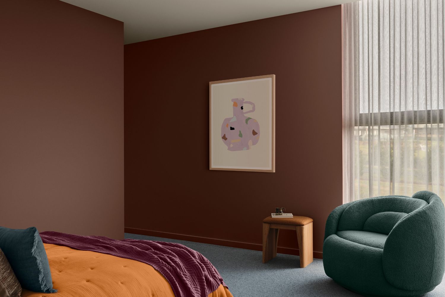
For the bedrooms, the team embraced bolder, deeper shades to create grounding, intimate spaces. In one room, Dulux Chocolate Treat, a moody, rich brown, sets a cosy foundation. Treloar adds, “The Evoke palette has brought a real sense of personality into this family home. By layering earthy neutrals with richer tones, the space now feels welcoming, conversational, and full of character. The colours create a cocooning atmosphere that encourages connection and comfort, transforming the home into a place where people naturally want to gather and spend time together.”

The second bedroom showcases the versatility of the Evoke palette with Dulux Baked Clay as a feature wall paired with Dulux Snowy Mountains Half. Velvet materials, dark timber tones and carefully curated décor work together with the walls to add richness, texture, depth and warmth to the space.
“Leaning into tactile materials will enhance the mood,” says Banfield. “Velvet, faux fur, marble, glass and mid-tone or darker timbers all pair beautifully with this palette. Curved or sculptural shapes help soften the depth of colour and keep the room feeling warm and inviting rather than heavy. And don’t shy away from mixing eras or styles – the blend of vintage, handcrafted and contemporary pieces is part of what gives Dulux Evoke its eclectic and expressive personality.”
For further inspiration on how to incorporate the Dulux Evoke palette within your own home check out our styling tips.

Autumn/winter styling tips using the Dulux Colour Forecast 2026 Evoke palette
- Layer colour with character: Blend influences from multiple eras rather than sticking to just one. Think art deco curves, postmodern boldness, and futuristic accents to make the space your own.
- Build from a soft base: Start with warm colours such as soft yellows, muted melon and warm mustard balanced with soft blues and chocolate. This calm foundation allows deeper accents – such as plums, reds and deep aqua – to add contrast and a cultured edge.
- Embrace texture: Texture is key. Mix materials like velvet, glass, mid-tone timbers and handcrafted pieces in decor and furniture, and don’t be afraid of patterns.
- Bring the warmth with your colours: In the cooler months, shifting sunlight can make your spaces feel cooler. Consider heroing warm-based tones like Dulux Baked Clay, Dulux Germania or Dulux Chocolate Treat to restore warmth and richness into your space.
- Add nana-chic touches: Incorporate colourful second hand decor to bring personality and charm. Keep an eye out for hand painted ceramic and coloured glass to add a point of interest to the room. If you can see it in your nana’s house, add it!
- Try before you buy: Lighting and existing finishes can change the appearance of a colour. Order some Dulux A4 Colour Swatches or test with a Dulux sample pot and paint a section of a wall or large card to see how the colour looks throughout the day in different areas of the space.
For more information