
The Gold Coast is undeniably glamorous; therefore, the homes situated here should be just as spectacular. However, before its renovations, the Glasgow apartment on the Gold Coast’s Main Beach was very tired and dated and didn’t really fit with the area’s reputation. The décor and colour scheme reflected that of the late ’80s, featuring large columns at the entry and pokey areas that restricted amazing panoramic views of the Gold Coast beachline and city. The apartment entirely lacked a reflection of the owner’s character and flair.
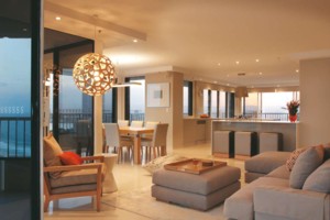
“The brief for this project was fairly extensive, including a total refurbishment of the apartment, focusing predominantly on the living and kitchen area while mixing the old and the new,” said designer Revy Bryce-Browning of Design Vision. “The owner was very open to new ideas; however, he expressed his love of a neutral palette that reflected his laid-back attitude. The comfort within the space was a focus for our design — the client intended all areas of the apartment to be comfortable and relaxed. Through calming neutral tones and soft, luxurious materials the atmosphere within the space promotes solitude and comfort. “We feel the space functions well for our client. He enjoys entertaining, so the open-plan scheme best suited his requirements. However, he needed a space that would serve to be private and multifunctional. The kitchen and TV/study were custom-designed (with a custom desk/TV unit designed by Deka Furniture) to accommodate his constant use of this area, while the lounge and dining area would be predominantly used for hosting guests,” Revy said. The body of work was focused largely on the entertainment and kitchen space, but careful attention was needed for the guest accommodation and master bedroom. The kitchen space would prove a challenge because vents, fire sprinklers and audio speakers would need to be redirected elsewhere.
A major design consideration was opening up the space to utilise the surrounding views. Therefore, a large wall and bulkhead restricting views out to the ocean were removed to transform the space into an open living area. “The previous apartment layout was rather dark in areas, such as the kitchen, that should ideally utilise light. By removing restricting walls and bulkheads, the use of natural light was achieved,” Revy said. Being on the beach, natural breezes now sweep through the open-plan space due to the removal of the existing kitchen wall. Sliding glass doors used throughout the space utilise the frequent afternoon sea breezes. “We chose not to include window treatments along the beachfront doors for fear of restricting light and views,” Revy said. The inspiration behind the design reflects the surrounding environment and the neutral colour palette, such as Resene paint in Tea in the kitchen/ casual dining/dining area and master bedroom, seeks to reflect the sandy coloured shoreline below. Wallpaper also helps to soften the space and creates a very subtle whimsical feature. An orange accent colour was an additional feature to give the space some attitude while remaining in the theme of its surrounding environment. “We sourced orange lanterns from Parterre Furniture to help mimic the warmth of an afternoon sunset,” said Revy. More of the budget was allocated to the special larger custom furniture pieces, and saved in other clever ways where possible. “The most challenging aspect of the project was being mindful of our client’s budget. Being able to balance the necessity between functional and decorative elements was a constant priority for us; however, we felt that certain items were well worth the expense. Throughout the entire process we tried to continually find new ways to use some materials/finishes in less expensive ways,” said Revy. For example, the inexpensive but glamorous mother-of-pearl-framed art (Designer Boys by Boyd Blue) was hung in the soft light of the entry over the simply detailed, customdesigned oak console table (designed by Gary Hamer Interior Design). Several key pieces of existing furniture were used to inspire textures and forms. “We recycled two gold French Louis chairs by reupholstering them (by Chair Co) in a sexy silver vinyl, bringing a modern eclectic twist to the master bedroom,” said Revy. “The materials were very specific to our client’s needs. We chose materials that were low maintenance and easily cleaned. For example, the materials used to upholster the bar stools were a commercial-grade vinyl (fabrics from Boyd Blue), allowing quick and easy removal of spills, which in the long-term provides longevity and durability in the fabric,” said Revy. The new award-winning Coral pendant, designed by David Trubridge and available at ECC Lighting, hangs in the living room and was selected to reintroduce a bit of ’70s rattan to the room — a tongue-in-cheek reference to how it was originally decorated. In the dining room, a stainless-steel Silantra pendant from Objx illuminates the beautifully detailed timber and stainless-steel dining table (designed by Deka Furniture) was to add a hard-edged contrast to the soft living room. For the kitchen, the designer selected Quantum Quartz Turino benchtops, a Bianco Vetro Park Avenue tile splashback, Laminex Stipple Seal cabinetry and polished travertine floor tiles from Metro Tiles. These tiles then flow through to the dining and living rooms, while for the outdoor area travertine honed tiles, also from Metro Tiles, were laid. For the bedrooms, Victoria Carpets’ Coney Island carpet from Cross Carpets allows continuity, an element that was essential throughout the entire project.
“My favourite design feature was being able to look into the master bedroom from the living space. We wanted the space to feel entirely continual. The master bedroom design flows on from the scheme devised for the living space; we knew the bedroom door would be left open, so both spaces needed to be designed as one. However, by using contrasting Eijffinger wallpapers of traditional graphics (the Grand Cru collection) versus modern stripes (the Bazaar collection), the space appears to have been fitted out in a gradual context rather than all at once,” said Revy. The White bed head and Bandini silky bedding both by Boyd Blue stand out in this space. “The project was made so easy because of the complete trust the client had in us. I think the renovation was most special because of the client. His devotion to the end result was apparent; his passion for a minimal but sophisticated feel really inspired our design decisions. Using the incredible view as a backdrop in our creation aided in the significance of this project.”
DESIGN VISION PO Box 326, Northgate Qld 4013
Tel 07 3267 1996 | Mobile 0402 382 455
Email revy@ designvision.com.au
Website www.designvision.com.au
Builder Living World Kitchens | Designer Director Revy Bryce-Browning and design assistant Meg Stewart | Project Managed by on-site manager and Revy Bryce-Browning | Photography David Sandison Photography


