Colour and design are at a crossroads, Leatrice (Lee) Eiseman – executive director of the Pantone Color Institute – told a capacity crowd in her annual seminar at the 2016 International Home + Housewares Show. After sharing some general colour trends and influences, Eiseman unveiled the nine colour palettes for 2017 from Pantone® View Home + Interiors.
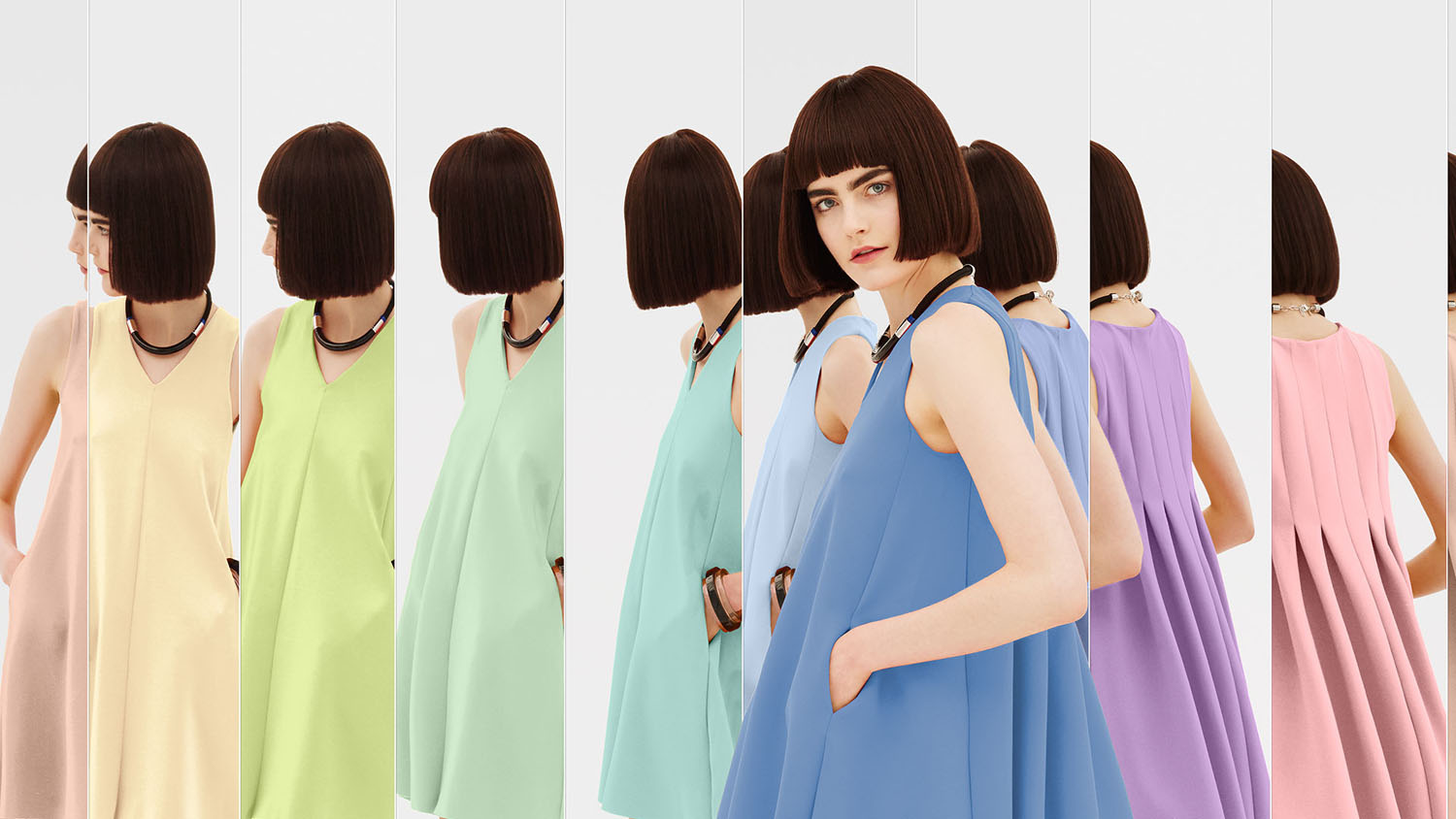
Day Dreaming – This palette is a continuation of the Color of the Year pastel theme, with colours that evoke thoughts that are light and weightless….in contrast to the heaviness of day-to-day stresses. A key here is that other colours, such as Yellow Iris and a Nile green, are used to expand on the blue and pink.
At Ease – A step from Day Dreaming, At Ease is grayed down for more of a sophisticated feel. A variety of ever popular neutrals, both cool and warm, are blended with muted tones in a way that seems effortless.
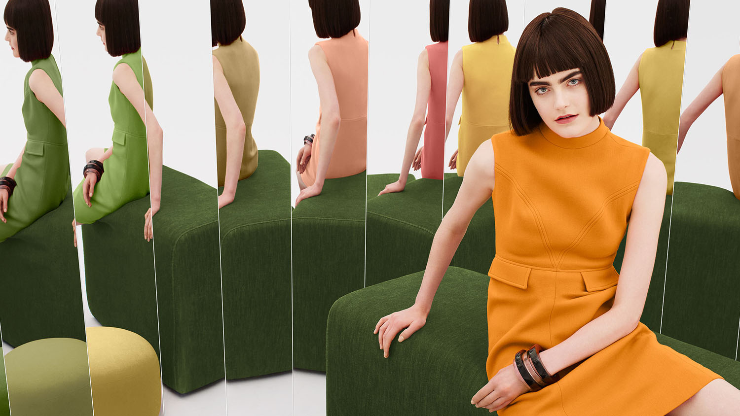
Native Instincts – Style-wise, current and future forecasts point to a homogenous mix of design and colour where a piece of Native American pottery is compatible with a Turkish kilim carpet and/or a pre-Columbian artifact. Likewise, this palette offers bold colours like a smoky orchid and a Carmine red along with softer Earth tones.
Florabundant – Just like its name implies, Florabundant is filled with the sumptuous beauty of rich floral hues. This palette offers a lot of drama from Pink Yarrow, Chrysanthemum, Red Dahlia and Baton Rouge and includes varying shades of green.
Acquired Taste – In both food and surroundings, an acquired taste means an appreciation for the distinctively different. Such is the case with this palette which offers a mix of colours and/or textures not commonly seen together, yet they combine for a palette that is subtly luxurious. Colours include Orange Chiffon, Pale Gold, Mulberry, Brandied Melon, a dove gray and a muted pink.
Forest Bathing – This stress-reducing palette is inspired by the Japanese practice of “Shinrin-yoku” or forest bathing. Studies have shown that a contemplative walk in the woods reconnects the individual with nature and elevates their mood. Several shades of green and blue-green are enlisted, which are contrasted by Grape Kiss and a refreshing Acid Lime.
Reminiscence – A different kind of walk – a walk down memory lane – is the mood conveyed here. Traditional shades like Maritime Blue, Sepia Tint and Rattan convey a sense of nostalgia and stability, but the mix of new colours like murky Martini Olive and Bird’s Egg Green keep the palette feeling fresh.
Raw Materials – Both the re-use and re-purposing of materials from nature and the health and wellness movement are represented in this palette. Zephyr Pink offers an unexpected pop of colour against the many, more natural tones.
Graphic Imprints – Described by Eiseman as “great fun,” this palette starts with a base of black and white but then pulls in a series of strong, vibrant colours with names that tell a story themselves: Blazing Yellow, Dazzling Blue, Prism Pink, Fandango Pink, Opaline Green and Orange Popsicle.
Owned and operated by the International Housewares Association (www.housewares.org), the Show was held March 5-8 at McCormick Place, and featured more than 2,200 exhibitors and over 62,000 total attendees from over 100 countries.
“We are all familiar with consumers’ constant desire to see something new, yet they still want, in many cases, to have somewhat of a familiar comfort level,” said Eiseman. “We have to assess our customers’ aspirations by using credible forecasts as a guide to invigorated colour design palettes that will inform and encourage new colour directions. The question is: What can we do to tweak our colour palettes to make consumers stop and take notice?”
Among the colour and design trends she shared are: the rising use as maps – both traditional and contemporary – as a design element; the resurgence of black and white imagery; power-clashing – “the use of unexpected colour combinations that seem to be discordant but yet they still work”; pixilated and digitised patterns; and the popularity of green, both as the colour of nature and of health and wellness
One of the important influencers of colour, “the film industry has always been a trendsetter in special effects,” said Eiseman. “The expectation level of the consumer goes up when these colours are seen on the big screen. They say: ‘Why can’t I translate this into a product at home?’”
As recent examples, Eiseman cited “Star Wars: The Force Awakens” (with a sequel coming in 2017), the re-engineered and brighter colours in “The Peanuts Movie” and the creative use of beautiful colour to depict each emotion in Disney’s “Inside Out.”
According to Eiseman, metallics remain popular, with “all kinds of household objects being transformed into objets d’art.” Iridescent flatware is not new, but technology is making it more vibrant. Coloured glassware is also popular, though so is clear glassware that is more about form and function.
And while sleek, contemporary looks are frequently seen today, the vintage or retro look is not going away either. “Rescue is the new buzzword that is replacing recycling,” said Eiseman, and handcrafted and raw materials are seeing resurgence.
Of course, there also is Pantone’s 2016 Color (or Colors) of the Year: Serenity and Rose Quartz, which represent a breath of fresh air in interior design. According to Eiseman, these colours represent a way of helping consumers “escape the stress of their modern lives, offering reassurance and security in difficult times.”
Many of these trends can be found in the 2017 Pantone® View Home + Interiors palettes that were unveiled at the Housewares Show. For ever-divergent tastes and styling influences, these nine distinctive groupings are:
For more information about the International Home + Housewares Show, visit www.housewares.org