The winter months bring new hues and the chance to update your living space. Interior and colour consultant Barbara Bromley, of Barbara’s AT HOME, talks with Lisa Doust and reveals the cool season’s hottest looks.

The global mood continues to influence interior trends and directions, and with this influence comes a less complicated lifestyle, especially in the home. Over the past couple of years we have become very efficient at integrating sustainability with comfort as a new living style, with every room in the house benefitting.
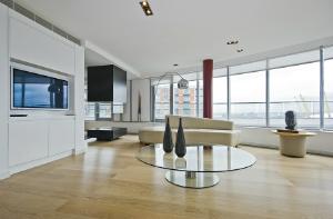
In general, expect to see oversized items appearing in natural materials. The thinking here is that, in the face of the global financial crisis, more people will be staying in. Favoured household items will include big sofas and chairs for cosy nights in and generously proportioned kitchen benches that serve as a gathering space for friends and family members.
Adding a dash of personality is the key to making a space your own, so enjoy the following tips and start exploring some new interior options this winter!
Seasonal shades:
We need colours and products that reflect an environmentally ‘greener’ world and this goes way beyond a trend; it’s now a way of life. Various shades of green have symbolised eco-living over the past few years but in 2009, the green message is delivered by the colour blue. There are watery blues for that continued vintage look, sky blues and the regal navy blue that now represents our commitment to living on a greener planet.
A cool, clean, Asian-influenced aesthetic is with us again this winter. Indigos, deep plums and purples, the new alternative to black and white, are showing up on fashionable, high-end products and are being mixed with whites, off-whites and browns. Yellow has been a star colour of late and is appearing in various shades, including mango and wheat.
Purple is 2009’s ‘must-have’ colour. Look for a greyed-out violet that works equally well as an accent or a neutral, as well as redder and plummier purples and blue-tinged fuchsia.
Complex and classic neutrals remain strong and bridge the area between black, which seems harsh, and brown, which doesn’t seem quite strong enough. The neutrals may have greyed, but look for lots and lots of vivid yellow.
Bright shades of orange, turquoise, teal, red and yellow are coming through strongly, thanks to influences from China, India and Turkey, while white is holding its ground and is showing up in plenty of corporate spaces. The contrasts to white are in the finishes and textures; matt versus gloss, shine and shimmer used on reflective surfaces and textured whites versus smooth whites. White inspires purity of thought, motive and result; exactly what we are hoping for from the corporate world.
A truly classic grey, with no undertones, is also in vogue for the season. This comfort colour either comes straight or is being dressed with lilac and blue undertones.
Fabric fantasies:
Wall coverings have once again come into fashion in a big way. Murals have emerged as a leading trend, with images covering everything from Parisian street scenes to baseball fields and children’s storybook fantasies. Murals are a popular choice and can instantly customise any room in the house.
Anything textured in wall coverings is extremely popular, with finishes used ranging from grass, cloth and sand, to animal textures and even glass. Paisley prints are appearing in greens, aquas, yellows and blues, while peacock feathers, with their delicate form and iridescent quality, are present in more subtle colours such as deep teal, greys and chocolates. For a more conservative look, choose a wall covering with an elegant and almost bohemian worn look.
You can also find fabrics to match your wall coverings. There are some lovely fabrics available with a vintage look, the result of ecological concerns resulting in fabrics being made with less dye. And, of course, you can find intricate weaves, fine and elaborate textures and lustrous overtones.
When it comes to floor coverings and furnishing fabrics for our living spaces, natural fibres are growing in popularity. Other influences are coming from the Far East, Africa and Turkey, where amazing colours and textiles are used to fabulous effect. Unexpected colours such as white, aqua, coral and lemon are giving our interiors a fresh outlook.
An earthy, saturated palette is reflected in the emerging Indian market, with vibrant colours related to fresh fruits and vegetables showing the growing strength of the natural food movement. Look for ethnic prints, modernised via bright colours and oversized dimensions.
Leopard and tiger-skin patterns are being paired with unnatural colours to give them a new feel. Moroccan motifs, such as grillwork, stars and paisley, work well in sheer and lustrous tapestries. Architectural elements such as skylines, landmark buildings and concrete structures are also being used — combine with a splash of exotic grasses, metal and lacquered wood to soften the look.
Visual and textural variety are important and it’s a matter of the old being mixed with the new. It’s wonderful to have the luxury of both vintage hues and bright new colours to work with.
After several seasons, stripes are still with us. New colour combinations and thicknesses energise stripes in an exciting way. Paisley is getting bigger and better, with bohemian and Moroccan themes updating these traditional patterns.
Look for lots of special effects this winter, in terms of patterns and textures. Expect to see plenty of black-on-black beading, stitching or embossing, along with bright metallics with a matt graphic overlay.
Changing rooms:
Updating the colour palette in your home is a big undertaking and should be carefully thought out. Before making a final decision on new hues you must consider the colours of the existing furniture in all living areas and bedrooms, the cabinetry and appliances in the kitchen, and any artworks you own.
Start with a neutral palette, as it will be timeless. This should be a rule of thumb for areas such as entrances, hallways, kitchens and bathrooms. Paintwork in bathrooms takes a knocking, so applying a fresh coat of paint can have a big impact. Select a low-sheen acrylic paint with superior anti-mould protection, which will ensure it can withstand the hot, steamy conditions of the bathroom.
Living rooms are where you can really have fun with colour. Again, it’s wise to start with a neutral palette and then add splashes of colour. This is the room where one of the most expensive items of furniture (the sofa) is housed, so make sure your new colours match this and other furniture items that you have no intention of replacing.
Bedrooms are the perfect place for using colour to reveal your personality. If you share your bedroom, involve your partner when choosing a new colour; it’s important that you are both happy with the final choice. Opt for something that is fun, exciting and soft at the same time. Add some colour with accessories such as bed linen, rugs and cushions; these items are easily changed from season to season and you can go for bold and bright in summer and warm and subdued in winter.
Your colour choices are uniquely personal and we all aspire to live in environments that reflect our personal style; we know what we like and what we want. However, some find it difficult to implement change when it comes to changing style and colour. It is this knowledge that presents the most compelling reason to use interior designers.
Interior designers are qualified and trained in their disciplines. They have access to industry contacts and product information which may not be readily available to the public, and they understand the effect of proportions, dimensions, perspectives, surfaces, textures and colours; not only on a structure itself but on our physical and emotional reaction to a structure. These fundamental elements of design can turn a house into a much-loved home, energise an office environment and turn an outdoor space into a haven.
It is a significant financial undertaking to repaint your home and the process can be time-consuming. Mistakes are costly and the impact of both financial pressure and time constraints can turn what should be an immensely enjoyable experience into an absolute nightmare. A good designer can not only help you to come to a final decision but may actually save you money by working with what you already have and combining these elements with the overall vision you have for your space.
Winter decorating tips
When changing your home from the cool palette of summer to the cosy shades of autumn and winter, think warm colours and rich textures, and turn to nature for inspiration:
- Temperature rising: A fireplace is a wonderful place to start when warming up for the winter months. It is also a fantastic way to re-energise your romance! Modern-day fireplaces come in all shapes and sizes and there are many affordable options available.
- Colour cues: If you are up for a little colour change, try repainting the family room. A little colour psychology can go a long way when it comes to warming up a room in the colder months.
- Printed matter: It’s nature’s palette that makes patterns like a paisley print, a heather weave or the faded flame-stitch seem so appropriate for winter. Selecting these patterns for upholstered furniture or accent pillows will make a strong seasonal statement in your home.
- Fab flooring: Shag, wool or fur rugs are great for layering over an existing carpet. The layering of rugs is a hot trend this winter, with the influence coming direct from the Near East.
- Material world: Winter is the season to bring back velvet, chenille or damask window treatments. If you are on a budget, ready-made curtains are available at most furniture stores and can be very cost-effective. Another affordable option is to drape a few yards of fabric onto an existing rod.
- Mood lighting: candles create such ambience! Choose candles that are rich in colour and cast off a lovely winter fragrance.
- Winter warmth: Throw rugs in soft chenille, wools and velvets added to beds and sofas are a good winter staple. These fabrics will add warmth and texture to your home as the season gets colder. Choose a throw with a bit of colour to add a touch of your personality, and buy one that is big enough for two. It’s always nice to share when it’s cold.
- Cover up: Because cushion covers are relatively inexpensive, you can have a number of options and change them to suit your mood. Why not cover your cushions in fabulously textured olive-green velvet for winter?
Kitchen connection:
The big trend for 2009 kitchens is an even stronger leaning toward clean lines, eco-friendly designs and open-plan design. The kitchen has the highest traffic flow in the home and designers are very close to achieving the perfect kitchen; they are now thinking within the square to fit in with our work hard/play hard lifestyle while simultaneously taking it easy on the planet.
Natural materials for the cabinets, drawers, cupboards and sinks continue to increase in popularity, with water filters, water-recycling equipment and recycling bins becoming essentials under our benchtops.
The latest sinks are either flush-mounted or under-mounted and integrated within the benchtop, with this all-important surface serving as a multi-purpose island to create a more welcoming environment while entertaining. CaesarStone, granite, marble and timber are the natural choices for benchtops.
If you’re looking at recreating your kitchen, the vogue is to recycle as much as possible by reusing materials found at reclamation yards and donating old cabinets, countertops and other fixtures and fittings to charities.
When making a decision on your new kitchen, opt for co-friendly paints and ‘green’ materials for countertops, cabinets and flooring. Great flooring choices include bamboo, eucalyptus and cork; these beautiful woods will add much to the look of your kitchen and are considered a renewable resource as they require about half the growing time of other woods.
When it comes to colour, beautiful earth tones, such as velvety taupes, pale aquas, and marine blues are proving to be a nice change from the stark white kitchens of the past.
Bathing beauty:
Modern bathrooms are a place of sanctuary, and your own personal spa should be functional with a touch of luxury. What we are seeing are clean lines with natural materials being used for flooring and walls.
Freestanding baths are proving popular, as is fabulous floor-fitting tapware. Lighting is an important part of bathroom design and is being integrated within both tapware and the actual baths. Heat lamps, a quick and easy way to ward off those winter mornings, are a simple way to combine light and heat.
If you prefer showers, then you’ll love the fact we are incorporating oversized showers in our bathrooms. The wet room is one of the hottest trends emerging in Australia. In its simplest form, it is a bathroom with a shower but without a traditional shower screen or base. It’s usually an open space with a gently sloping floor and central drain. We are seeing this simple principle applied in a huge range of bathroom designs — from small spaces to larger, spa-like havens.
To work, wet rooms should look open and sleek, so opt for wall-hung toilets and basins to free up floor space. Consider recessed or cavity cabinets and flat-panelled cupboards to make storage disappear. As part of the floor plan, also look at building in low walls or benches used for both seating and storage purposes.
Waterproofing is obviously a major consideration during the upgrading process and, traditionally, wet rooms were fully tiled enclosures. Now, however, we are seeing different materials being used, including natural stone, treated concrete, treated woods and even Corian®. As well as keeping the water out, these materials make excellent non-slip options.
Along with ever-fresh white, the latest colour trends for bathrooms include chocolate and black. These dark hues serve as the perfect backdrop for accent shades of faded lime and citrus.
Spaced out
Here are several tips for making small bathrooms appear bigger:
- Less is more: A simple layout with attention to detail is a good way to approach any design. Mirrors, clever storage and floor-to-ceiling tiles will make your bathroom appear larger. Light colours and subtle open shelving will also give the illusion of a bigger space.
- Floor plan: If you are starting from scratch, pay particular attention to floor layout. It’s nice to have the option of a shower when one is pushed for time, so look at integrating the shower and bath and look for a frameless glass screen shower door that can fold back on itself. It is functional and at the same time will keep the illusion of open space.
- Wet, wet, wet: If you don’t want a bath, opt for a wet room. Do away with the usual shower screens and open up the free flow of space and water. A wet room can make a small bathroom appear big and a big bathroom looks luxurious. Achieving that look of effortless space requires quite a bit of effort during the design and planning phase.
- Off the wall: Look at vanities and toilets that can be wall mounted, which will give the floor a presence of space. And, if possible, add a skylight to let the beautiful sunshine in and provide the illusion of extra ceiling height.
Barbara’s AT HOME offers a full interior design service, including custom-designed furniture and furnishings, for both residential and commercial projects. Barbara Bromley travels extensively to design shows to uncover the latest products and trends, which she interprets in her own way to offer her clients something special.
BARBARA’S AT HOME 503 Pacific Highway, Crows Nest NSW 2065 TEL 02 9437 5354 WEBSITE www.barbarasathome.net


