
Every year, trend experts around the globe release their predictions on how they think our homes will look in years to come. A simple online search will lead to a plethora of trend blogs and seasonal forecasts. Here in Australia we take our cues from overseas trend experts and forecasts as well as trends that are unique to our culture, climate and environment. Trend experts at the ISCD (International School of Colour and Design) in Sydney get together on an annual basis to workshop their predictions on what design styles and colours will mould and shape homes of the future. They also incorporate observations from overseas design fairs and installations. Some of the key directional themes they identified for future design trends include the continued focus on sustainable living, the emergence of African culture and style elements, the new space-age influence on fashion and interiors, and the ongoing evolution of geometric design in both interiors and exteriors. Five key themes that ISCD pinpointed as important for design moving forward were Greenscape, Earthenware, Vivid, Geometrix and Galactic.
Greenscape
Greenscape is more than just a collection of green colours; it is a natural palette inspired not only by nature, but by our awareness of preserving nature. Sustainability, recycling and environmental responsibility are all practices that have now become an integral part of our daily lives and the products which we use regularly. Greenscape includes concepts of growth or new sprouts, new ideas and social issues. Areas such as sustainability, recycling and environmental care in design have now been fully integrated into our way of life and are here to stay. Our future will focus on maintaining this awareness and enhancing the ways we protect the world and our resources. Karen Warman from Resene Paints describes the source of this trend as “the strong push for sustainability and the collective effort that has evolved to become a personal responsibility for each of us, shifting the focus of the green palette as we combine our lifestyles with more sustainable living rather than just sustainable living defining lifestyle. Caring for the environment has become embedded in our culture and the way we do and think about things — a part of our daily lives — challenging preconceived ideas of what is truly ‘green’.” Karen believes this mindset “underscores a move away from basic earthiness towards the warmth and comfort of copper browns, a shift from gold towards yellows, and a fusion of warmth with the green palette. Brown-enhanced golds, such as Resene Fleetwood, warmed yellow greens, such as Resene Kombi, and rich greens, such as Resene Green Room, will grow in popularity.” The Greenscape palette that has been developed by Resene features a range of soft blues and greens. Karen describes the range as having “a misty, soft and thoughtful cast over sectors of the green and blue palette, with frosted, pale aquatic colours such as Resene Comfort Zone. The soft focus hints at subtle depths and lends a sense of ethereality. Blues are softened and diluted, moving away from strong nautical-influenced shades to hues reflecting the freshwater aquatic. Ambiguous colours such as Resene Guru, difficult to place in a single-colour palette, cross the line between blue and green.” Greenscape is about a green mood, a feeling of freshness, vitality and growth and recreating natural textures in a variety of new ways.
Earthenware
Another natural colour trend emerging, Earthenware offers a strong textured range of colours suggesting warmth and safety in a rich palette across all areas of design. Burgundy, terracotta, aubergine, chocolate and mauve are all appearing in interior and textile designs. Earthenware encompasses textures that echo the patterns of nature from the earth, desert and sand. Fabrics demonstrate sandy ripples, velvety sheens and shiny reflective surfaces that complement earthy colour hues. From a sociological point of view, the earth colours create a grounded, nurturing mood. Design elements in this trend include a wide range of textures, the use of natural materials and an emphasis on recycled products. There is a new interest in people of the land and in third-world countries, as well as a resurgence of a modern African style of decorating, so textiles, fashion and homewares are now incorporating a luxe safari style. Retro design is also alive and well, particularly in graphics and furniture, best demonstrated by Orla Kielys’s new range of wallpaper and fabrics incorporating the Earthenware palette in a slightly retro way, with unusual colour combinations reminiscent of the 1970s. Porter’s Paints collaborated with the ISCD to develop an Earthenware colour palette. Marketing manager Caroline Edwards describes the basis on which they developed the palette: “Our escapism into the depths of indigenous cultures influences our desire to relive exotic adventures. Whether it be Moroccan, South American or the Eastern Cape, rich colour from these cultural influences plays with perfect harmony in the colour spectrum.” Warm accents cooled down with indigos are the perfect complement to any interior or exterior home.
Vivid
Optimism and a mood of celebration are reflected in the Vivid trend. Bright, clear colours give a surprising lift to the built environment in particular, but throughout the design world, a vivid rainbow of colour is predicted. The Vivid colours are a reaction to the greyed-off neutral colours that we have been experiencing for the past three to four years. With white, grey and reduced colours dominating our interiors, we are starting to yearn for bright splashes of colour and a more optimistic outlook. Shiny surfaces and glossy fabrics reflect this mood, as does the increased use of statement lighting and transparent colour. Often, vivid colours are a reaction to times of difficulty, such as global recessions. Prue Royle from ISCD observes that “the gloomier people’s thoughts, the stronger the uncertainty, the more colourful the prints and the brighter designs will become. We will see a more contemporary slant on brights, with the use of degradé — colour gradations — in the form of stripes and subtle colour blending and gradation.” Vivid colours are not confined to interiors; increasingly, technology is allowing us to use bright, clear colours in exterior structures. Dulux compiled a Vivid-themed paint palette with warm mandarin tones, yellow-based greens, bright electric blues and sunny yellows. This palette works perfectly with white and grey or to add a jolt of seasonal colour to winter rooms. Andrea Lucena-Orr from Dulux describes the palette as one which “reflects our emerging positive outlook and mood. There’s an optimistic future on the horizon with this bright yellow, fun orange, pretty violet and fresh green. The blues are synonymous with happiness, taking in blue skies and endless summer days at the beach!”
Geometrix
A strong black and white geometric theme is appearing as a contrast and reaction to the delicate, illustrative patterns that replaced minimalism a number of years ago. Fragmentation in the form of geometric patterning is appearing in textiles, furniture and architecture. However, it is a combination of vivid hues and greyed-off neutrals that give the Geometrix style its contemporary look. Prue Royle from ISCD has observed the trend towards “strong, bold lines and shapes which are appearing on packaging, fabrics, furniture, flooring and even exterior building façades”. Geometrix is slowly evolving to lose some of its rigidity and become more prismatic in shape, with soft edges and layered disc shapes. Spicy yellow and fuchsia tones will be offset by deep grey and shimmering metallic silvers. This happy trend will gain momentum with younger markets.
Galactic
A new and different theme that is well overdue appears in the Galactic palette. The new space age is upon us, with sharp design features and an unusual range of colours, from warm grey to soft violets and electric blues, in textures as diverse as shiny metals and lush velvets. Sculptural forms in lighting and homewares, repetitive modular shapes and shimmering surfaces will give a futuristic mood to interiors and fashion in particular, but across the design world, the space age is here. Fashion catwalks have been showing “space age chic” for the past year and it seems interiors are following. Balmain’s structured shoulder pads and glittering metallics in deep milkyway blues offset with grey, silvers and blush pinks seem to be moving off the catwalk into our interiors. Wattyl Paints compiled a paint palette based on the Galactic theme, with hues of deep indigo, soft violets and moody blues. This palette works beautifully when overlayed with warm metallic tones, crisp whites and lavender colours in a variety of textures,. In addition to the distinctive themes and palettes observed by the ISCD, there are a number of fascinating trends emerging overseas that are moulding our textiles, furniture and accessories. The Maison Objet design show, held twice a year in April, is one of a handful of directional European shows that profiles seasonal trend directions that inevitably appear in our markets. Some of the key themes and directions that were observed at the last show include:
Diaphanous:
A softer, more tactile style of decorating with the emergence of a gentleness and calmness to our designs. Soft, pleated textiles and translucent shapes with a touch of whimsy and humour are appearing in the form of statement furniture pieces and innovative wall dividers. Oki Sato’s Cabbage Chair is made from waste paper left over from fabric designs. This innovative chair allows you to peel back the layers of paper to transform a tube into a beautiful and perfectly shaped chair. Futuristic in form and material, this trend looks towards the future with a positive attitude, embracing technological advancements. New materials are explored in ground-breaking ways, such as The Diamond Chair designed by Nendo (Tokyo) and inspired by the atomic structure of diamonds. This futuristic chair design absorbs pressure but remains flexible, similar to the organs and muscles of the human body. With the use of rapid prototyping, the chair was manufactured using only two single pieces of material. Innovation has no anxiety or guilt associated with it. We are looking backwards less and have moved on from the nostalgic themes of the past few years. Materials include futuristic shapes and diaphanous finishes using techno science and soft technology through textiles and lighting techniques. The amalgamation of nature and technology is showcased in Lonneke Gordijn’s Dandelight, which combines electronic systems and dandelions in a battery-powered LED light which is covered in Dandelion seeds. Translucent finishes give us a perception of space and feature objects become a statement of beauty.
Animalia:
A perennial favourite, the animal form continues to be celebrated as a decorative element in our interiors. The two most distinctive styles showcase first slightly sinister, mythological themes, and second quirky, oversized designs which are a new take on the “Chalet” trend that has infiltrated European design over the past few years. The new “Wonderland” range from iBride uses a combination of fantasy, mythology and reality to create thought-provoking design pieces based on the dreams of Alice. The Martha and Madeleine trays juxtapose predator and prey using ornate illustration, while “Martin” the mule wall unit combines practical storage in a humorous and sculptural form. The Chalet trend takes on a new life in the form of oversized sculptural pieces. Frederique Morel’s life-size needlepoint-covered trophy head sculptures made from polyurethane taxidermy moulds and finished with real antlers add a decorative element to the Chalet theme. Based on the needlepoint skills that her grandmother displayed, Frederique decided to recreate the look, with each piece telling a story. Quirky oversized animal shapes are being used sculpturally as playful statement pieces and animal motifs remain a perennial favourite. Zebra and snakeskin designs in black and white will emerge strongly, as will a fresh new take on leopard spots using offbeat combinations of pop colours in electric blue and bold purples. Expect to see animal skin motifs moving into the bathroom in areas such as tiles, mirrors and bathroom furniture. Ceramica Cielo recently launched its Jungle collection, made by blending natural hides with ceramic to reproduce a finish that looks and feels like the actual skins. Pony skin, python and crocodile skins have all been recreated in this haute couture accessories collection.
Human forms:
Our fascination with the past is evident in the slightly confronting move towards using the human body as inspiration for design pieces. With a blend of surreal and pop art humour, human anatomy is being interpreted in ways that we have never seen before. Cell structure is recreated as a basis for porcelain plates, skeletal shapes become the basis for decorative lighting pieces, and our vascular system decorates a statement chair. Designers are breaking down the intricate makeup of the human body to imitate the texture of human skin to use as upholstery fabric, with thumbprints employed as decorative ceramics. The beauty of Thelermont Hupton’s Hand Hooks, which grow from the wall in a series of familiar gestures, are in stark contrast to the Eye Clone lamp from Paris’s 5.5 Designers. These lamps are cloned to your individual eye colour and are produced in hand-blown Murano glass. No body part is sacred, with brain footstools and skull chairs sitting alongside fingerprinted ceramics.
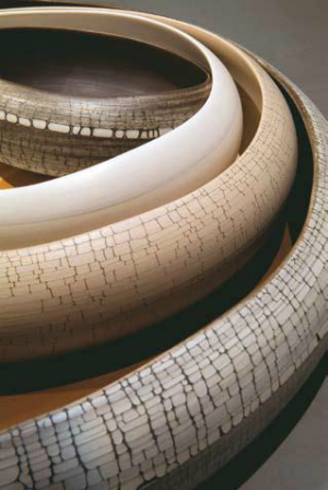
Touchwood:
Our love of natural timber has led to the imitation of wood patterns in quirky and fun ways. We are seeing wood and wood patterns used in wall coverings, floor rugs and innovative furniture pieces. Bodo Sperlein gained inspiration from the delicacy of twigs and branches in his Yauatcha collection of tea accessories commissioned by restaurateur Alan Yau. The products reflect not only the diverse heritage of tea culture, but also the sculptural forms of wood, with twig handles and detailing. On a quirkier note, Yvette Laduk’s Woody Wood rug is a clever interpretation of a timber cross-section with textured rings and a burnt bark edge. Timber panelling and flooring take on a new dimension with stacked log flooring and wall panels that emulate a rustic wood pile, or the Deesawat range of outdoor furniture that brings fun and function to outdoor essential pieces such as clothes lines and furniture. Limed oak, white- and grey-washed timbers are making a resurgence in the marketplace; combined with glossy white lacquer or pop colour pieces, these timbers are becoming core decorating staples. Amerind has recently launched the Premio range of architectural panels into the Australian market in a range of cool grey timber tones and bright, primary Gloss colours. While commentary on trends makes for fun and fascinating observation and debate, gone are the days when we slavishly follow them. These days we are more likely to select aspects of a trend that appeal to us and that fit within our own homes. Most trends are moving away from shades or tones of a specific colour and are more concerned with observing broader global and human issues and how we respond to them. Whether it is a reaction to the depressed financial market which stimulates the use of bright, vivid colour, or our love of technology that allows us to create fragile, diaphanous designs, each trend will have a small impact somewhere in our lives.


